~Pete Turner~

Comment:I think that this is a great picture, and I would definitely take a picture like this for my colour project. I also aspire how she has only focused on one part of the image and blurred the rest out.
Composition:
|
Connection:
From my perspective, The image that Pete Turner took attracts peoples attention because of the way he took it at eye-length and blurred out the background. I also think that this overshadows other pictures on his website because of how the blue contrasts with the puddle and the stop lights in the image. I think the photograph is in thirds, this is because it goes more pastel towards the top right of the image but way more deeper blue creeping to the bottom. I think this image has been took at night, because of how dark the photograph is. You can tell that the photographer has used a lot of his effort to capture this image because he would've got down on the floor at foot height, at a certain time and edited it by blurring everything but the puddle.
context:"A pioneer of color photography, Pete Turner’s career began during the infancy of color photography, at a time when color was used almost exclusively for commercial purposes. Unlike many contemporaries, Turner embraced color, seizing opportunities that allowed him to master the process and to create the imagery he felt compelled to make. Unconcerned with the labels of “art” or “commercial,” he has deftly created a life’s work that blurs these boundaries. Turner achieves his vision by combining the technical tools of photography with a perceptive eye for compositional color. Learning to manipulate hue and saturation early in his career, Turner created photographs that looked unlike anything previously seen, such as Giraffe. Over the years, he has continued to push the medium of photography by employing an impeccable sense of timing and a long-running fascination with geometry and surrealism." This is from "https://www.peteturner.com/Bio/index.html"
|
This is a colour based image consisting of a range of different lights surrounding a grid with water in which stretches to the back of the image. There is also a traffic light present in the distance which appears to be smaller due to how far it is, compared to the blue, lit up road. The photograph seems fairly new as it seems that it has been taken on an advanced piece of technology due to the clear capture of the detailed wet effect of the water closer to the viewer, this most likely would require the use of a modern camera to capture this effect as it is a more complex subject compared to older cameras which do not focus on such details. The photograph has a fair amount of color, but not much range as there are mainly just blues surrounding the darker coloured puddle and the bright multicoloured traffic lights. In the left corner of the photograph there is a much darker shade of blue and hints of black creating a more bleak look, which contrasts the image entirely as it has tranquille mood to it. The fact that there are no people or any animals of such, makes the place seem quite isolated, but the use of the colours light blue and white do not create a melancholic tone to it but rather the opposite, making me feel that it is a peaceful place. The traffic lights and buildings are all on the top half of the image full of life but placed away from the main focus of my image. making the road seem like it stretches out further, this could also be because the photographer has taken the photograph a lot lower than regular eye level, potentially foot level. The photographer may have used Photoshop to make sure the different shades of blue to capture a perfect blend which is pleasing to the eye, also to darken the edges. I think this image has been took after sunset due to it being a dark, eerie image. Usually, roads are like this more towards midnight so it could be from then. This image has been took from a straight on angle, to capture the whole street rather than pointing down.
John williamson

CommentI think if I redid this image I would have to put warm soapy water in a bucket, then place the flower in the tub. I would also have to photoshop the image to make it "warm" looking, and make the water more blue looking.
|
ContextMy home is in Northumberland, England, providing me with plenty of motivation to capture images of the countryside and coast at their best. Some of the best photographic opportunities in the UK exist here.
My passion for photography has taken me on extensive travels around the world, photographing scenes, landscapes, and events. I am told that my images have a distinctive style which captures the essence of the people and places I photograph. From the lavender and sunflowers of Provence, to the tea plantations and stilt fishermen of Southern India, and the grace and beauty of the National Dance Company of Cuba, the images in my picture library reflect the feeling I have for the subject. I don't mind admitting that the adventure which comes with the territory also adds to the enjoyment, and makes the image capture all the more valuable. This is from "https://www.johnwilliamson.co.uk/about.html" ConnectionFrom my point of view, I think John Williamson has took this image by putting soapy water in a bucket and placing the flower of top. I think this image attracts peoples attention because of the way he took it at birds eye view and blurred out the background with bubbles so the flower is center image. I also think that this overshadows other pictures on his website because of how the blue contrasts with the white soapy bubbles and the green stem. I think the photograph is in thirds, this is because the flower is in the center of the image and the background is in the two sides. I think this image has been took at in the middle of the day , because of how neutral and bright the photograph is. You can tell that the photographer has used a lot of his effort to capture this image because he would've had to make the soapy water, place the flower in and keep it still to capture the image he wants.
|
Composition
This is a birds eye view image consisting of soapy, icy water which is closer to view and a body of water which stretches to the whole of the image, the water going from a foamy white to a light blue as it reaches further to the bottom right hand corner. The photograph seems fairly new as it seems that it has been taken on an advanced piece of technology due to the clear capture of the foamy effect of the water closer to the viewer, this most likely would require the use of a modern camera to capture this effect as it is a more complex subject compared to older cameras which do not focus on such details. The photograph has a fair amount of color, but not much range as there are mainly just blues for the coloured water, white for the bubbly soap. However, others may argue that if you look very closely at the middle part of the flower it has hints of brown from when it has grew. In the right corner of the image there is a much darker shade of blue and hints of grey creating a more bleak look, which contrasts the image entirely as it has tranquille mood to it. Clearly, rule of thirds has been used in this photograph, because the flower is in the center of the image and the background is on two sides of the flower. I think this image has been took at in the middle of the day , because of how neutral and bright the photograph is. You can tell that the photographer has used a lot of his effort to capture this image because he would've had to make the soapy water, place the flower in and keep it still to capture the image he wants.
Travis Rathbone

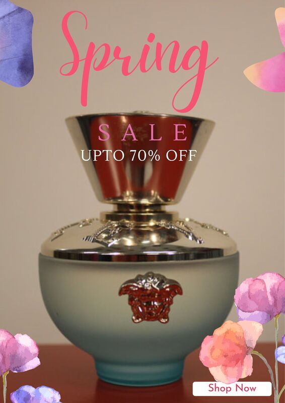
CompositionThis is another birds eye view image consisting of a perfume bottle on a colourful background which is in the center of the image and is surrounded by a pale pink colourful background and blue lights that gives us shadows, going off on the left hand side. The photograph seems fairly new as it seems that it has been taken on an advanced piece of technology due to the clear capture of the bottle and label, this most likely would require the use of a modern camera to capture this effect as it is a more complex subject compared to older cameras which do not focus on such details. The photograph has a soft blues and pinks in the background and lighting that contrasts with the warm tones of the bottle. The white label stands out against the rest of the image and makes the viewer focus on this spot. Clearly the rule of thirds has been used in this photograph, because the the top of the bottle is in the top third, drawing your eye to this spot. The bottle is also in the middle of the image, with the label right in the center which gives a strong compositional technique to the image. I think this image has been in a studio as the lighting is quite complex as we see two shadows and a graduation in the corners. In my opinion I think the camera would need to be on a tripod and reflectors used to the soften the lights. The ISO would be 200, a low Fstop as it is close to the image and quite bright. You can tell that the photographer has used a lot of his effort to capture this image because the lighting is perfect and the colours are balanced and enhance the image. |
ContextI have been researching this photographer and this is the information I found:
"Apostrophe is an artist representative agency and production company with offices in New York and Los Angeles. We connect top-tier artists with advertisers, corporations, brands, and other media outlets worldwide to create compelling work across multiple platforms and disciplines. Our roster embraces innovative talent, including photographers, directors, stylists, and creative artists across the country. Together, we are a team of conceptual thinkers and practical strategists. Our team is adept at translating our clients’ and artists’ needs and goals into exceptional work, bringing each and every project to a successful outcome, all the while meeting and exceeding client expectations". This is the website I used: https://www.apostrophereps.com/about
ConnectionFrom my point of view I think that the photographer, Travis Rathbone has used a graduated colourful background, with blue shadows and a contrasting pink background. I think this links to my theme of 'colour' as it is saturated and pops out and I really like the object of the perfume bottle and I might use this idea to inspire my own outcomes. I also think the photographer has explored different view points, this image seems to be a birds eye view and this is something I could explore in my own work. Overall, in my opinion I think nthe photographers image relates well to the theme of colour and it has made me think about the different pathways I can explore.
CommentI really like this image because of the shadows and the soft colours created by the lights. I think this is the image I am going to use the most to inspire my own photography.
|
Coggle
Mood boards


Statement of intent
Theme?
The second theme in my project which I chosen to demonstrate was colour. I aim to focus on the brightness, vibrancy and appearance of the objects I photograph, Some of the manmade objects I've chosen are perfume bottles, jewelry and makeup. My favorite manmade object that I look forward to take photos of is the perfume bottles, because I can get different shapes and sizes in front of my infinity curve and it'll looks really professional! I can also use the different settings on my camera to make it seem darker, lighter and to make it stand out more. Then for nature-made I've chosen all sorts of distinctive coloured flowers and fruit. I will show my work by grouping them in sixes, putting my edited pictures on and doing my 4C'S. I would like to explore these different objects in colour because the shape, and size is interesting.
For my initial research I will start by looking into "colour" photographers. At the moment, I have two in mind that I want to look at. The two photographers I am choosing to research for this project are Pete turner, john Williamson and Travis Rathbone. I looked at both of their work individually because they link back to my project and mood boards. I chose Pete turner, because the lights clash with each other and it has a range of vibrancies. The image that Pete Turner took attracts peoples attention because of the way he took it at eye-length and blurred out the background. I also think that this overshadows other pictures on his website because of how the blue contrasts with the puddle and the stop lights in the image. Pete Turners photography really interests me, and inspires me to want outcomes which he has. I then chose john Williamson for my second research, because of the way he makes the daffodil float in the soapy water, with the blue water I think it contrasts between colours. I think in my photography project id retake this image, I would also have to photoshop the image to make it "warm" looking, and make the water more blue looking so the bubbles glisten. For my last photographer I have chosen Travis Rathbone. I have chosen Travis Rathbone, because of the way he sets his objects he is photographing and making the different bright colours mix with each other with out over complicating the image.
When I chose this theme, my initial thoughts were of different objects such as flowers, necklaces and perfume bottles. After thinking about the project title more thoroughly I realized there are so many more routes for my work to go down such as mixing my flowers with my idea of bag making or a mask, and how I could combine and contrast the different objects. If I get a range of different objects, this will allow me to have more images to experiment with and contrast, once refining my work in Photoshop. I have refined my work by mixing two of my ideas into one.
To show progression through my work I will start by photographing the perfume bottles and jewelry that I can bring into school. I will then develop these images further by taking more ideas from them and editing them in Photoshop. I then hope to venture around outdoor places with a range of different flowers in for one of my shoots. I already have a lot of ideas running through my head for this project which will propel me in the right direction.
I have 3 months to produce my Website of work towards the production of my final piece. I aim to complete my initial research within the 3 week and start photographing by the 4th week in order to give me the time I need to show progression. I will then continue to develop my work in photoshop and be prepared to go out again with my camera and capture new images to enhance my project. When I have completed the project, I will select my best photography outcomes and display them in my final gallery.
As my project progresses I will use annotations throughout my webpage labeling my ideas and development clearly, also adding my best and worst images. This will also help me to reflect on the work I produce. I will mainly seek advice from my Tutors and my peers on how to make my work better, as I’m always aiming to push myself to new levels. I will also watch tutorials and demonstrations and find my own as well to help me develop my skills and knowledge of Photoshop. After the creation of my final portfolio I will write a final evaluation on the project as a whole, reflecting on what went well and what I would do differently or change given the time.
Shoot one
Shoot 1 I hope to start to get photos of flowers as these are really colourful and will help me with my project


Best: |
Worst: |


best: |
Worst: |


Best: |
Worst: |

Work on canva


Best: |
Worst: |


Best: |
Worst: |


Best: |
Worst: |

Work on canva


Developing my ideas in Photoshop
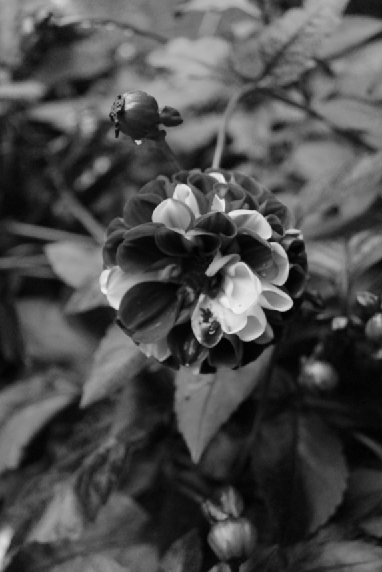
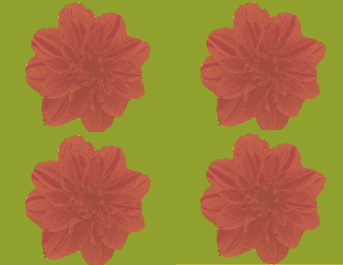
I am developing my knowledge and skills in Photoshop, using different filters and layers, linked to my research. Below I have tried a black and white image to contrast with my colour
|
|
|


Best: |
Worst: |
Shoot two
For these shoots I decided to paint fruits different colours, as a contrast to the natural colours and to make them stand out. Below are the pictures of the set up I used and the final outcomes.


Best: |
Worst: |

Developing my ideas


|
|


Shoot three
I decided to go back to taking pictures of natural colour as I prefer this.


Best: |
Worst: |
Work done on Canva


Work done on Canva


Best: |
Worst: |

Developing my ideas further
To develop my work I changed the colour and saturation in photoshop and then my images were printed out for me. I created two designer bags as one of my outcomes for this project. I enjoy doing this but it took me a long time.


Best: |
Worst: |
Outcome: |
Photoshop duration: |

|
|


Shoot four
I think I've took my bag ideas as far as I can and now have moved onto perfume bottles to extend my ideas and outcomes.


Work done on Canva


Shoot five
In this shoot I've decided to move onto different types of jewelry


Mock Exam
Outcome one: |
Outcome two: |

|
|
Duration:
|
|
|


|
This is my final outcome in photoshop, and I have captured the process as I go along by snipping every different change I make to my image. I think the best thing that I did to this image is change the background to an autumn colour, to make the image seem more warm. I could improve my outcomes by editing my other photographed flowers around the image and maybe putting it like a vogue magazine on the front cover.
|
This is my final outcome in photoshop, and I have captured different aspects of editing the image with my app called "snip tool". This is where I snip any changes to my photo, so anyone looking at it can see my process. I think the best thing I did to this image was playing around with the saturation and vue, this is because it made me achieve a bright-coloured badge but also makes it stand out in colour more. One thing id do to achieve my highest potential for this image is to change the background and edit it onto another image so its not singular.
|

|
|
|
|
|
|

|
